


Oil Painting for Beginners
I’m going to walk you through everything you need to know to confidently mix the colors for your oil painting.
How to pull your color palette from your reference photo using Canva.
The basic color theory you need to understand what you’re mixing.
And finally, how to mix your actual paint step by step.
By the end of this lesson, you’ll have a complete, accurate color palette and the confidence to start painting.
🌟 Lesson Plan
Pulling a Color Palette
Step 1: Find the mockup we created in our last video.
Step 2: Add a new page — you can do that by clicking the new page icon.
Step 3: Next, we’re going to add a square. Click the Elements tab, type in “square,” or go to Elements → Shapes and choose a basic square. Resize the square and move it to the top right of your page.
Step 4: Now click the square, change the color, and use the eyedropper tool to pull a color directly from your reference photo. We’re going to repeat this step and start building our palette.
I organize my colors from darkest to lightest. I do this because it’s much easier to lighten a color than it is to darken one.
So the first color I pull is always the darkest color in the mockup. Then I copy and paste the square and place it right next to it for the next darkest color.
Step 5: As you do this, you’ll notice some colors look very similar — that’s normal. Once you finish pulling all the colors, line them up and delete the duplicates.
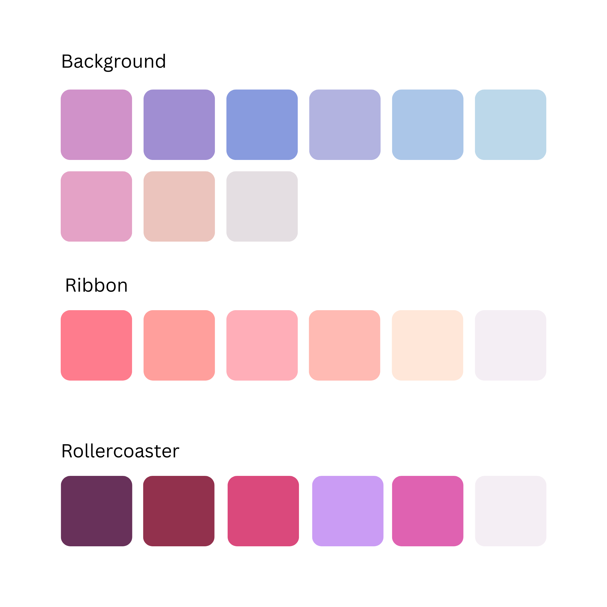
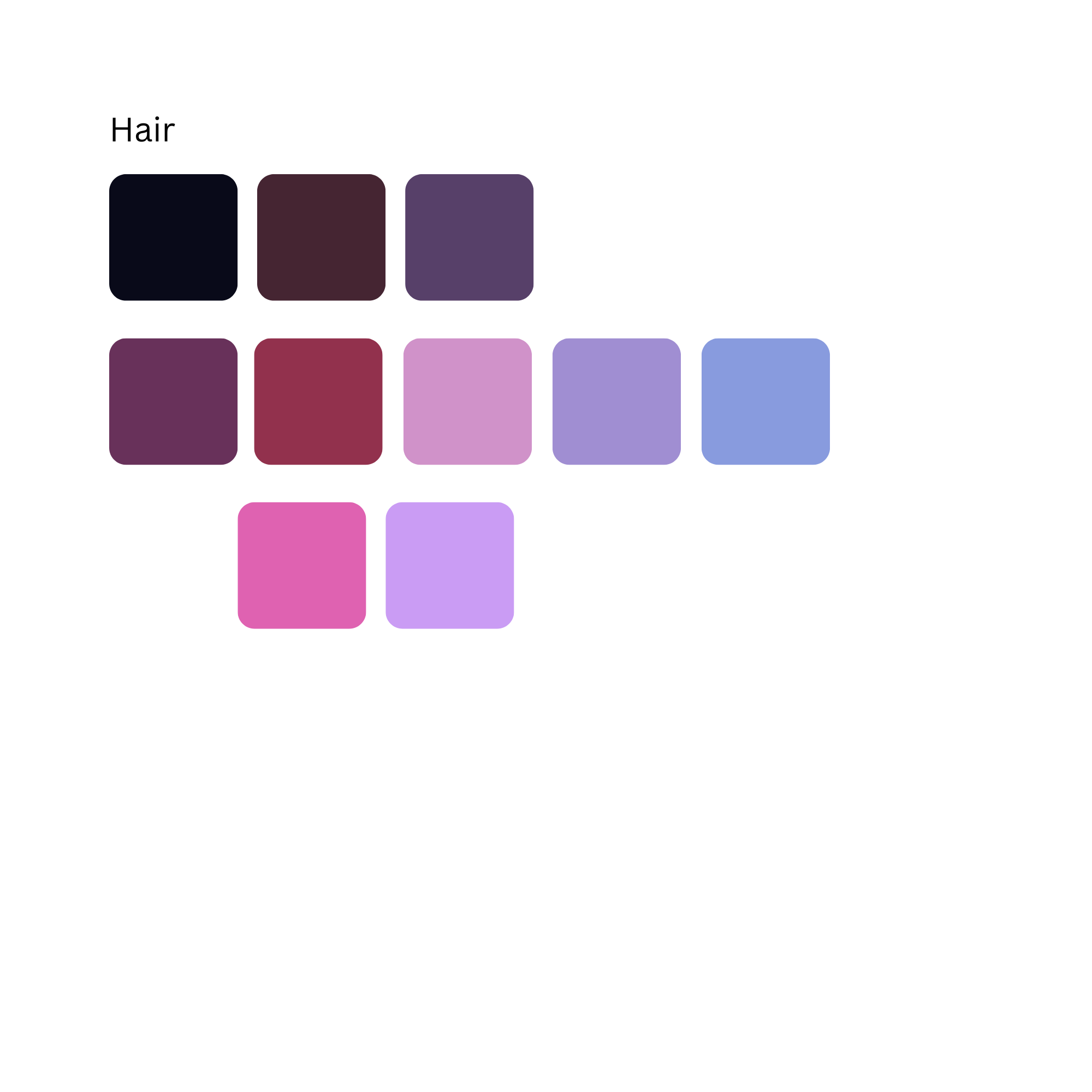
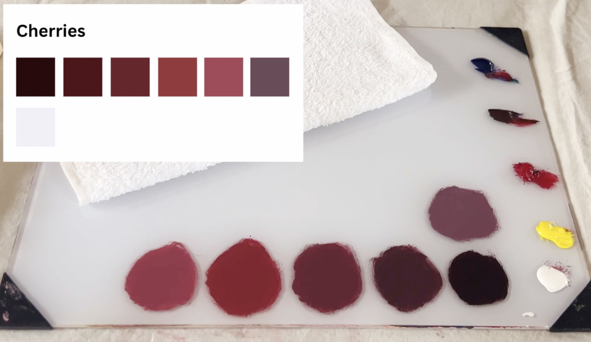
Here’s the full palette I pulled from the cherry mockup…
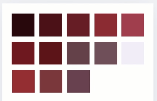
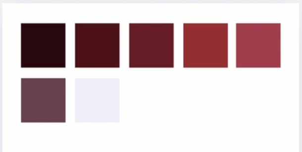
and here it is after removing the overlapping colors.
Now I repeat the same process for the rest of the mockup.
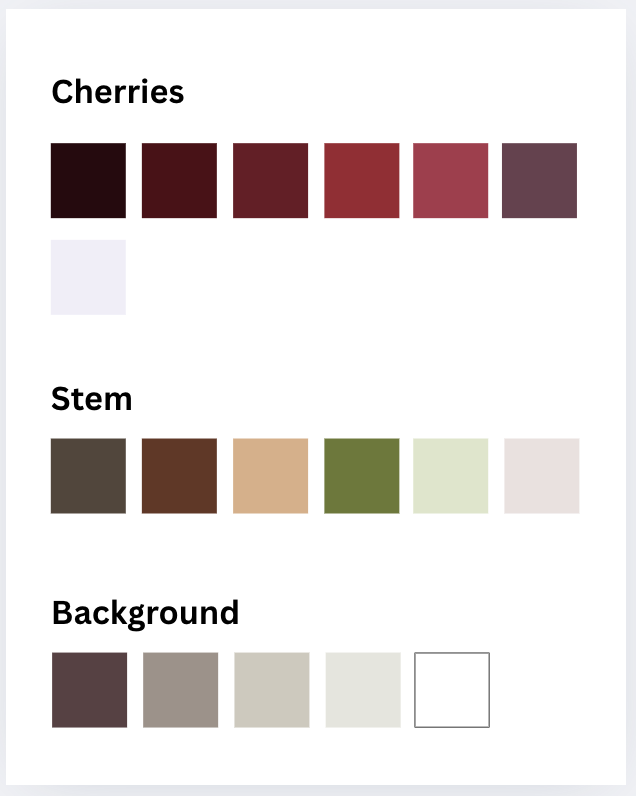
If you want to go a step further, you can label each color.
This is our beginner example.
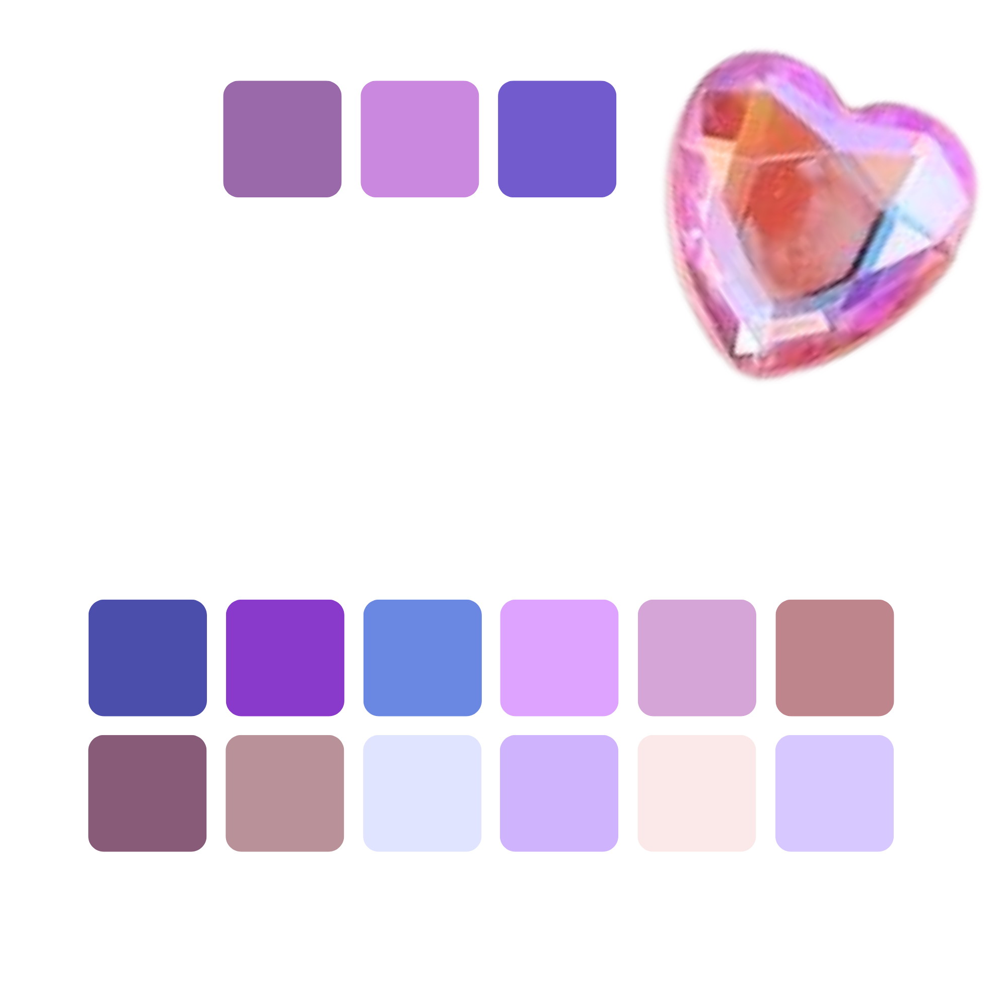
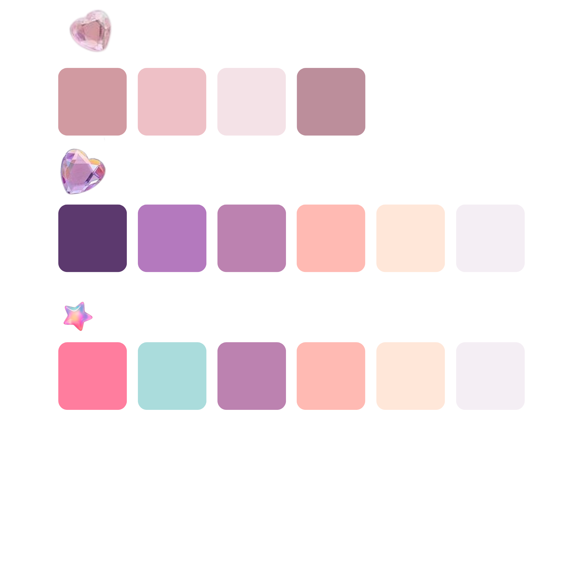
For the advanced piece, I used multiple pages to organize the different sections. And it’s completely okay to work in sections — even for small paintings.
Only pull and mix the colors you’re ready to paint in that sitting.
And here is the color palette from our advanced example.
Once your palette is ready, it’s time to mix — but first, we need to cover a few quick color theory fundamentals.
I use a limited palette for all of my paintings. It’s cheaper, simpler, and once you understand how colors work, you can mix almost anything.
Our limited palette includes: white, yellow, red, brown, and blue.
💡 Tip: I do not use black straight from the tube. It makes colors dull and muddy. Instead, I mix black using equal parts brown and blue.
First, you need to understand the color wheel.
Quick Color Theory Fundamentals
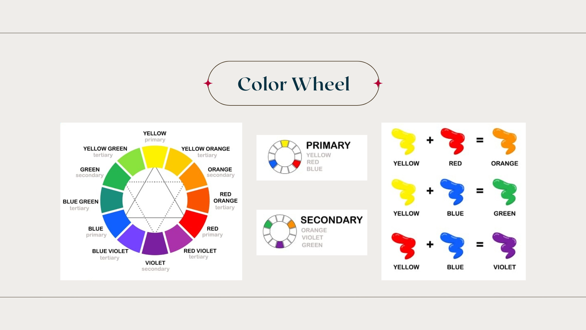
Our primary colors are red, blue, and yellow.
We use those to mix our secondary colors:
red + yellow = orange
yellow + blue = green
blue + red = purple
You can then shift these by adding more of one color to create different shades.
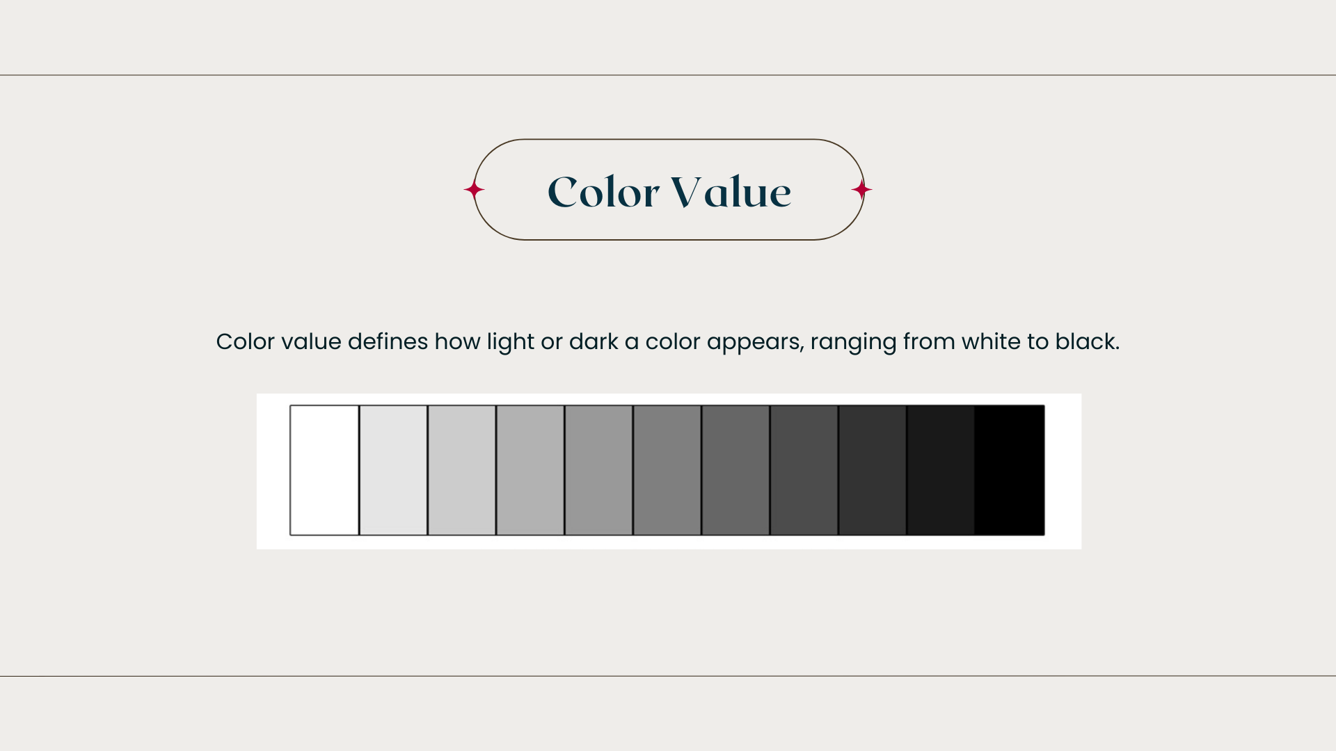
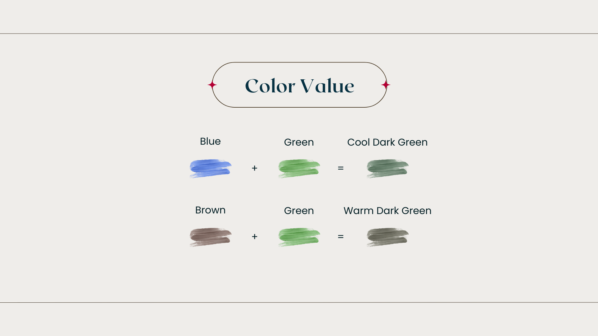
Next is color value — how light or dark a color is.
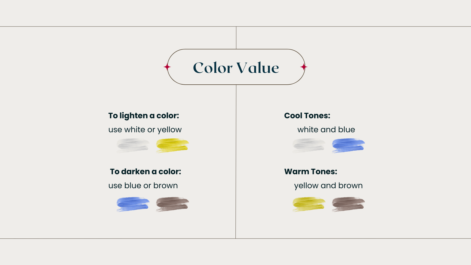
To lighten a color: use white or yellow
To darken a color: use blue or brown
White and blue are cool tones.
Yellow and brown are warm tones.
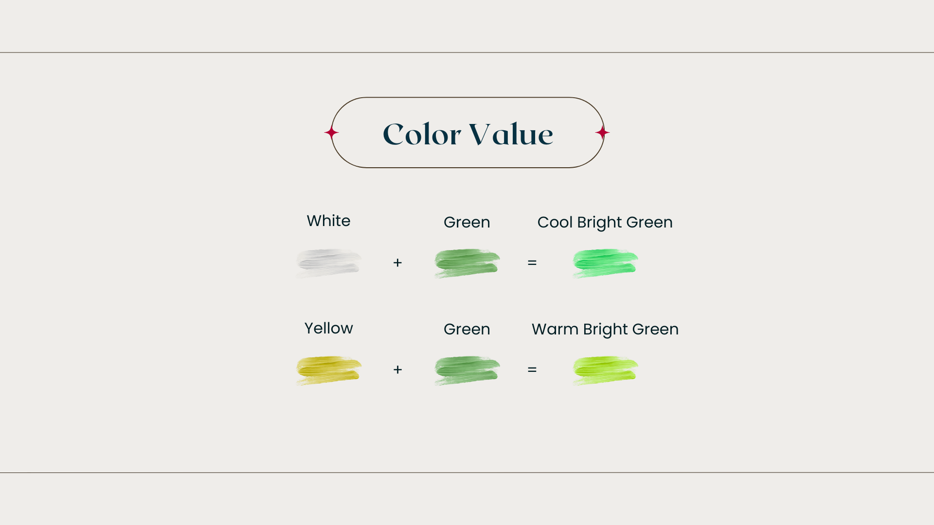
So if you add white to green, you get a cool bright green.
If you add yellow to green, you get a warm bright green.
Same with darkening — blue makes it cooler, brown makes it warmer.
Now let’s use all of this to mix your first color palette.
I’m using Geneva paints, which already include the medium.
If your paint does not, mix in a small amount of medium — and use the same amount in every color.
Your paint should feel buttery and silky — not too thick, not too watery.
💡 Tip: If you pulled your palette in Canva, turn your screen brightness all the way up before mixing. Low brightness will make all your colors come out too dark.
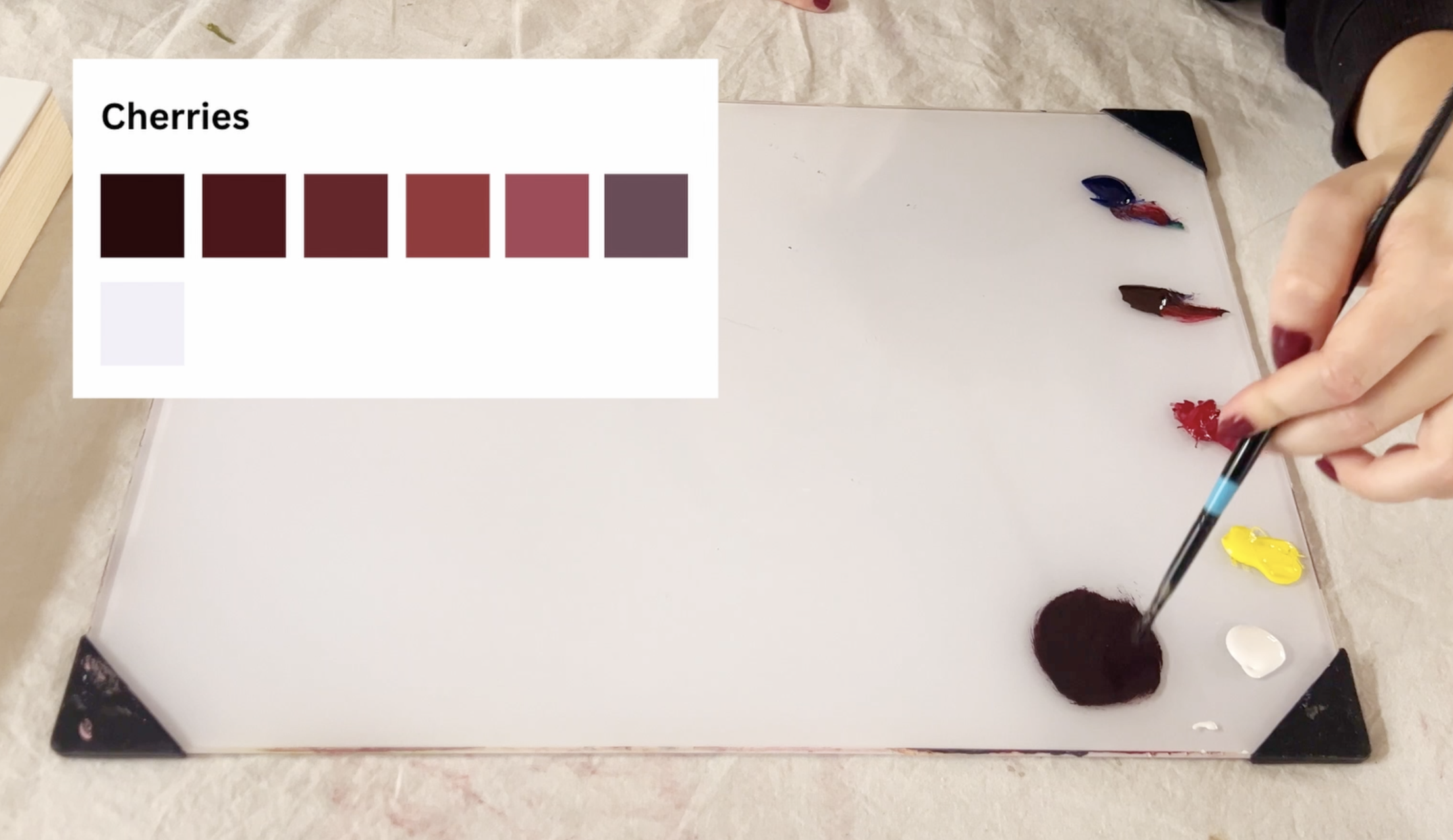
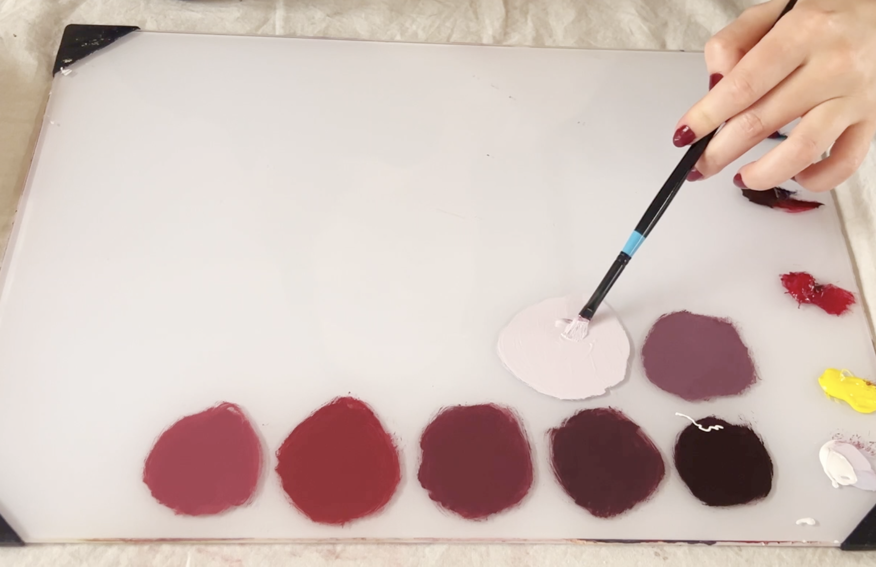
Now, using our beginner cherry palette…
Step 1: I always start with the darkest color. This first color is a dark purple-red. I mix black using brown and blue. Then I add a small amount of red.
Mixing Your First Color Palette
Step 2: To make the next color lighter, I take the excess off my brush and slowly add white — not yellow, because red and yellow make orange, and that’s not the color I want.
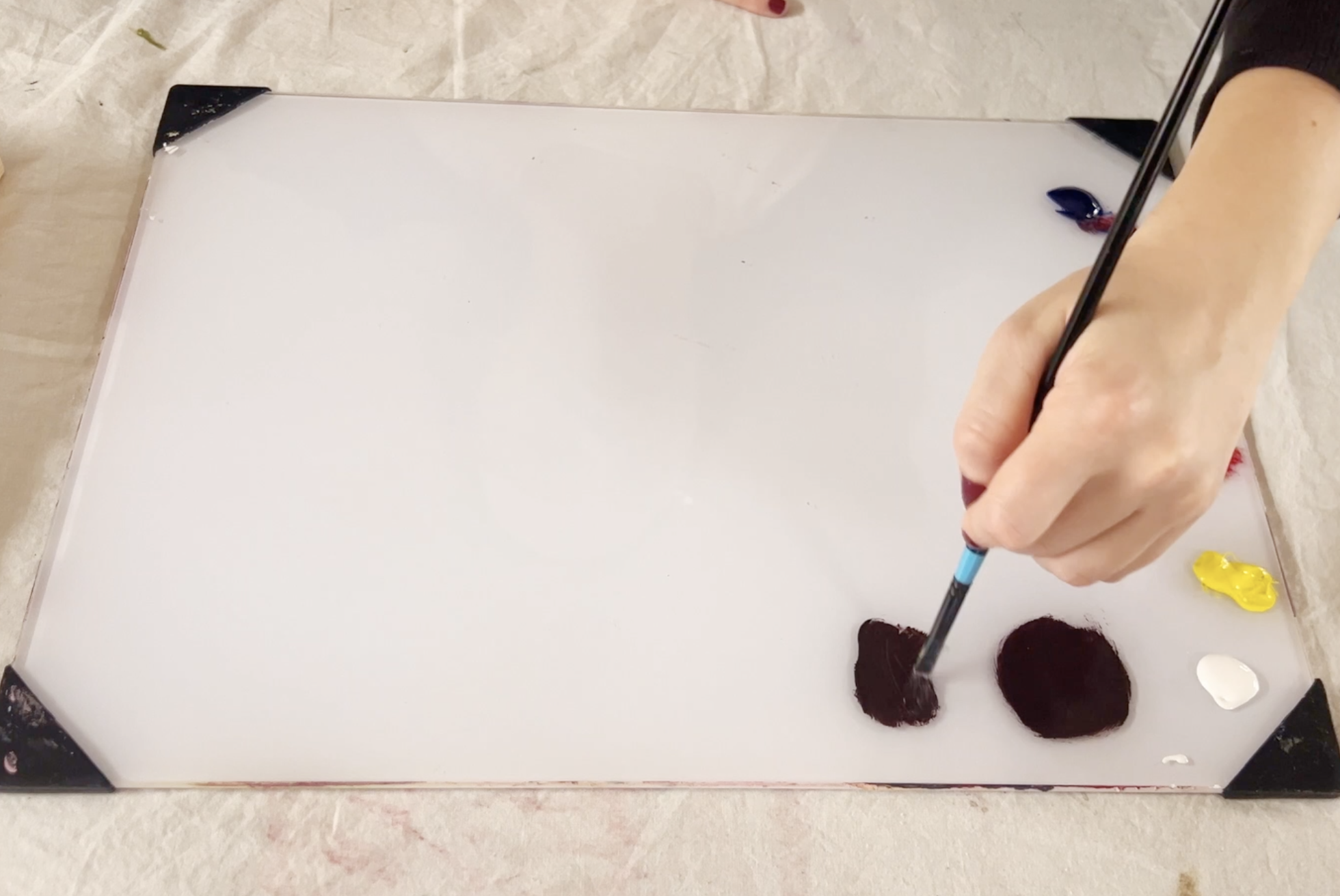
Step 3: Repeat this process of adding a little bit of white and a little bit of red until you reach your desired color. Once I reached the fourth color, I added a little bit of yellow to warm up the color.
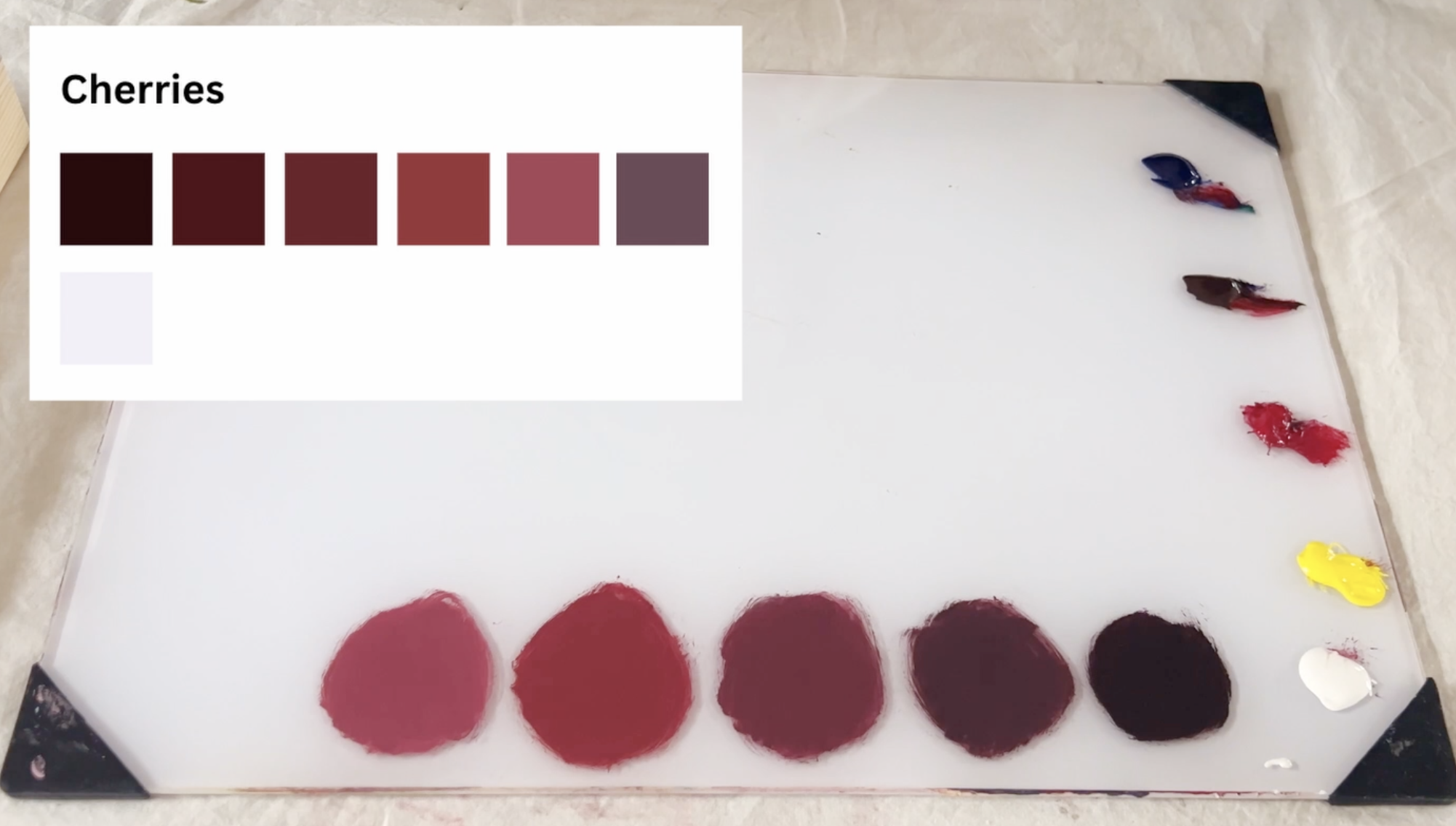
Step 4: Next is the plum color. Red + blue makes purple. A little brown warms it. Then white to adjust the value.
Step 5: For the highlight white, I clean my brush completely. Then I add a tiny bit of blue to a lot of white.
And that’s it!
This is how to quickly mix a color palette that has similar colors but differing values.
If you still have questions or you're mixing a color that is harder to achieve, head over to the advanced portion of this lesson where I’ll go over how to mix a color palette similar to this, how to fix a color that has been mixed with too much of one color, and how to easily incorporate colors that are not include in our limited palette like this one. (COMING SOON)
If you’re happy with your palette and ready to paint, head over to the next lesson.
Meet me in the next chapter, where we’ll go over beginner painting techniques.
Help Keep This Course Free
This course is completely free because I believe learning art should be accessible to everyone.
If these lessons have helped you and you’d like to support the creation of more free tutorials like this, you can leave a donation below. Every contribution helps me continue making educational content and improving this course for future artists.
Thank you so much for being here and supporting my work! It truly means more than you know.